How to Build an Elegant One-page Scrolling Website
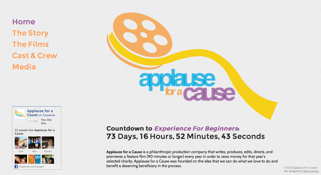
For my latest website, I decided to try something a little different. I wanted to take a stab at a single page design with multiple sections. I’ve seen it done a few times before, but the style isn’t even close to being commonplace.
There are a couple advantages to having a one-page website. First of all, it loads very quickly. Since you don’t have to deal with a CMS or a database you can get away with just having one HTML file, one CSS file, and one Javascript file. Once the page is loaded, all the content can be accessed instantaneously because there are no additional pages to load. And finally, this type of design can look really elegant if done correctly.
Here are a few things you can do to build a similar website. Be sure to reference the source code. This tutorial assumes intermediate knowledge of HTML, CSS, and Javascript.
1. Keep the left side fixed in place.
Here’s how the page is set up. Inside our #main div, we have two divs with ids #leftsideand #rightside. #leftside contains the navigation (and any other unmoving content) and#rightside contains all the content of the page. We also have our footer, which we’ll get to later.
Now we need to style both of these divs to keep #leftside off to the side and in a fixed position. We’re also going to fix the footer in the bottom right corner and hide it for now.
2. Set up the navigation.
We’ll set up our navigation links as an unordered list, which you can then style however you’d like.
Notice how instead of linking to pages, we’re linking to ids. For example, clicking the Media link will scroll directly to whichever element has the id media. The first link has the classcurrent because it corresponds to the page that will be visible when the page is loaded. You can use this to style the currently active section differently than the others in the navigation. Later, we’ll make the current class switch to whichever section is visible.
3. Put in the sections.
Now we need to put in the sections, which will act as pseudo-pages.
We need to take care of some styling. Let’s going to set the minimum height and bottom margin of the sections to 500px. That way, when there is very little content in a section it occupies a minimum of 1000 pixels to give it the appearance of being a full page. When there is a lot of content, there 500 pixels separating it from the next section so they don't run into each other.
4. Make the scrolling magic happen.
If you populate the sections with content, you’ll notice that it looks like a multi-page site if you ignore the tiny scrollbar. You click on a navigation link, and it instantly takes you to the corresponding section. Now let’s make this page a little more elegant by making the navigation links scroll to the sections instead of jumping to them.
I created a plugins.js file and copied in the following Javascript plugins. Feel free to use my plugins file. I combined them all into one file to minimize the number of HTTP requests, causing the page to load slightly faster.
- jQuery
- jQuery One Page Nav Plugin
- jQuery.ScrollTo
- Lazy Load (not necessary for this part, but this will come up later)
By sure to include this Javascript file in your index.html file by putting the following code somewhere in the <head>:
Also include the following code in the index.html file inside a <script> tag to make it work with the navigation links.
Now, when you click on a navigation link, the browser will automatically scroll to the correct section.
5. Lazy Load the images.
My site has a lot of images, which can slow down the loading of the page. To fix this, we’ll use a jQuery plugin called Lazy Load. This will make certain images not load until they’re scrolled into the viewport. You can optionally make them fade into view instead of instantly appearing, which I think fits with the aesthetic of the site. Make sure the Lazy Load plugin is included in your plugins.js file.
Normally when you have an image you’d do it like this:
For the images you want to work with the Lazy Load plugin, you’ll have to change it to this:
Let’s take a look at what we did here. We set the src of the image to img/place.gif, which is a transparent 1x1px image. This is because you need an image as a placeholder, but nothing needs to be seen before the image is in the viewport. The actual image is placed in data-original. When the image comes into the viewport, the Lazy Load plugin replaces the value of src with the value of data-original. The <noscript> tag allows browsers without Javascript to still show the images.
Now we need a bit of Javascript to activate the plugin. Add the following code inside your<script> in index.html.
6. Fade out elements that don’t fit.
Remember the footer we added in before? We had it hidden by default, but with no explanation. Here comes the explanation. When the page loads, the footer will overlap the content if the user’s screen isn’t big enough (or if they have the window resized too small). We only want to display the footer if there’s enough extra room. Add the following code to your<script>:
Now let’s walk through what we just did there. We created a function calledhandleDisplay() which fades the footer in or out based on the size of the viewport. The number 1263 was determined through trial and error, and will be different for you depending on the size of your content and the size of the footer. Then we have event handlers to callhandleDisplay() whenever the window is loaded or resized. Check out the demo for a more concrete example. If you never see a footer even when the window is maximized, your screen is too small to display it. If you see a footer (it’s in the bottom-right corner), resize the window until it collides with the content and watch it disappear. Just like magic.
Conclusion
You’ve just learned how to make a single page with navigation buttons that scroll to their respective sections when they’re clicked. You also learned how to have images fade into view when they are scrolled into view and how to hide elements that don’t fit on the page. While these don’t necessarily need to be used in conjunction, you can combine them to make a pretty elegant website.
Be sure to reference the demo and source code if you want to try it on your own. Happy coding!